On Twitter the following image is shared widely what should prove that the 4th vaccin is causing excess deaths.
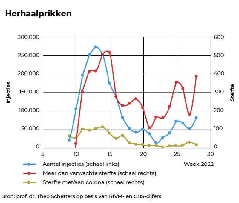
Let’s see if this is likely to be true
Method
Death numbers:
- The number of deaths are collected at the site of the RVIM: https://www.cbs.nl/nl-nl/maatwerk/2022/30/overledenen-per-week-provincie-en-gemeente-week-29-2022
- The average of these numbers per week for 2017, 2018 and 2019 is calculated. Unfortunately there is no data for 2015 and 2016 with the given agegroups
- The difference of the number of 2022 with this average is calculated
Vaccination numbers
This is done in Excel
- The number “Vaccinatiegraad herhaalprik” is taken from this page https://www.rivm.nl/covid-19-vaccinatie/cijfers-vaccinatieprogramma
- The number of vaccinations is calculated by multiplying it with the number of people in each agegroup
- The difference between week n and week n-1 is calculated
- Agegroups are merged so they corresponded with age groups of the death numbers
Results
A graphic design program is used to compare the graphs of Schetters and the found values
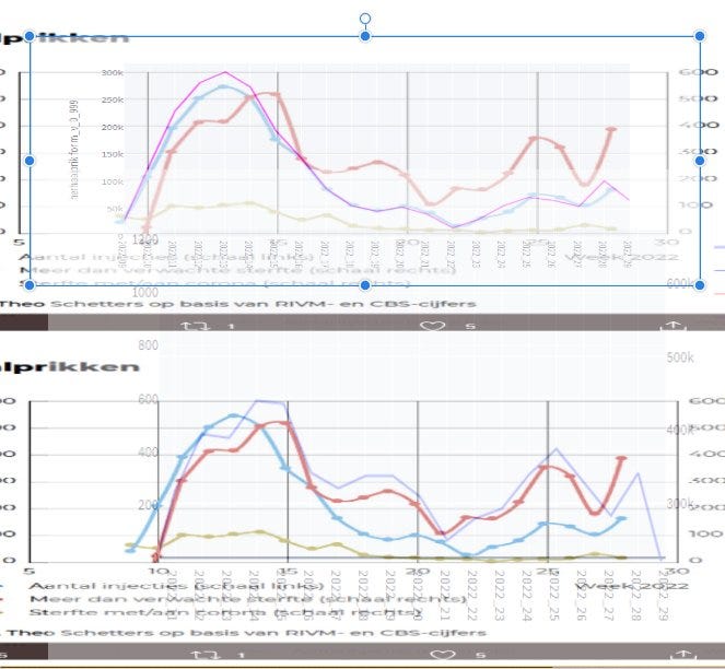
It is clearly visible that the lines are quit the same. Maybe there is a difference due to rescaling (see: https://www.cbs.nl/nl-nl/nieuws/2022/22/in-mei-oversterfte-behalve-in-de-laatste-week/oversterfte-en-verwachte-sterfte) and the fact that the average is taken from 2017 to 2019 instead of 2015 and 2019 like the CBS does (the numbers with the same agegroups for 2015 and 2016 are not available), but because the differences are small and the trends are the same, it is left for what it was. We can conclude that the graph of Schetters is not wrong! But is the conclusion right?
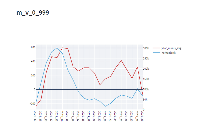
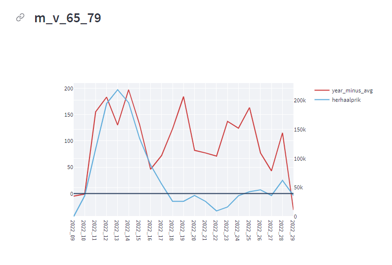
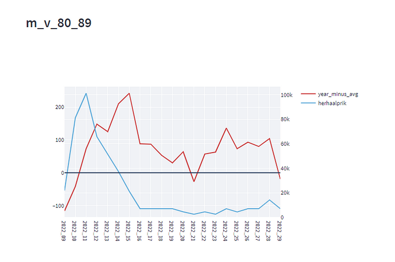
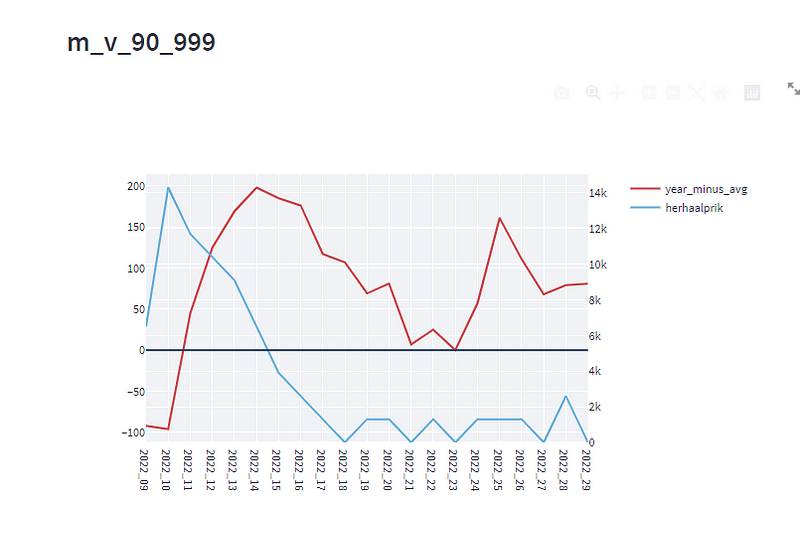
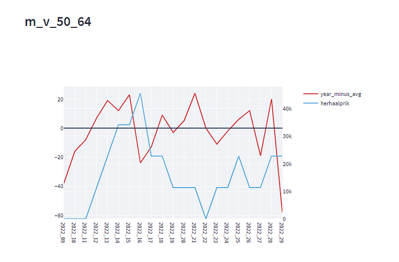
The totals seem to show a correlation. But now we make a graph for each age group. (under 50 years old there is not a 4th vaccination given yet)
Conclusion
We can see that if we divide the data in age groups that the lines aren’t close anymore, so a causality is very unlikely.
Links
Interactive webversion : https://rcsmit-covidcases-covid-menu-streamlit-6cenk1.streamlitapp.com/?choice=37 (how = year_minus_avg)
Sourcecode: https://github.com/rcsmit/COVIDcases/blob/main/oversterfte.py
Excel files
COVIDcases/boosters_per_week_per_leeftijdscat.xlsx at main · rcsmit/COVIDcases
10+ scripts about the COVID-statistics in the Netherlands, accessibile at…github.com
Datafiles:
https://raw.githubusercontent.com/rcsmit/COVIDcases/main/input/overlijdens_per_week_meer_leeftijdscat.csv
https://raw.githubusercontent.com/rcsmit/COVIDcases/main/input/boosters_per_week_per_leeftijdscat.csv
https://raw.githubusercontent.com/rcsmit/COVIDcases/main/input/herhaalprik_per_week_per_leeftijdscat.csv
See also
Changes
- This phrase has been removed: (Note: for excess death they use the difference with the death number and number corresponding to the 95 confidence upper interval as far as I know, so the number Schetters takes in account is already doubtful)
- We can see that if we divide the data in age groups that all correlation dissapears has been replaced by We can see that if we divide the data in age groups that the lines aren’t close anymore
- This graph has been left out
- After reading this and this, the title has been changed, it is now “Analyzing the graph of Theo Schetters” instead of Debunking Theo Schetters. I don’t know him and have nothing against him as person.